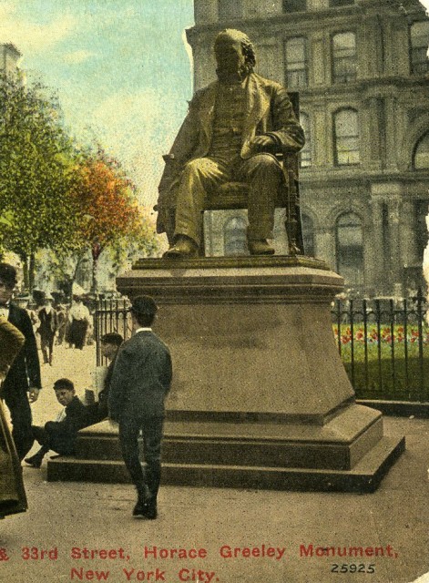
It’s a much loved story that after Abraham Lincoln’s Cooper Union speech, he went to McSorley’s pub for a beer. It is also said that he and Horace Greeley went to the New-York Tribune building to watch over the typesetting and proofing of the speech for publication in the next day’s paper. But when standing in Greeley Square at 33rd St and 6th Ave, in front of the bronze statue of Horace Greeley, created in 1892 by Alexander Doyle – it’s a little easier to believe the story about the Tribune.
Horace Greeley, born February 3, 1811, was famous for founding The New-York Tribune. The paper began publishing on April 10, 1841 and set a standard for journalistic integrity in stark contrast to the sensationalism of rival publications, such as the New York Herald. Semi-independent, it represented a editorial innovation – it tempered its Whig political leanings with a social conscience. It gave ink to many of Greeley’s strongly held causes including workers’ rights, women’s rights, scientific farming and most notably the abolition of slavery. Those views on slavery led to one of the most famous exchanges of the Civil War. On August 19th 1862, Greeley wrote an open letter in the paper to then President Lincoln, criticizing his failure to make slavery the dominant issue of the war. Lincoln responded,”My paramount object in this struggle is to save the Union, and is not either to save or destroy slavery. If I could save the Union without freeing any slave, I would do it; and if I could save it by freeing all the slaves, I would do it.” Lincoln issued the Emancipation Proclamation one month later.
Because of Greeley’s political convictions, he aspired to be more than a newspaperman. Having briefly served as Congressman from 1848 to 1849, he ran unsuccessfully for the House of Representatives in 1850, 1868, and 1870, for the U.S. Senate in 1861 and 1863 and for President in 1872. During his presidential bid, his ardent positions were attacked and derided. He was depicted as a fool in the press, most notably by political cartoonist Thomas Nast. He lost the campaign – Ulysses S. Grant beat him in the popular vote and later, after he died, defeated him in the electoral vote as well. He was the only candidate in history to pass away before the electoral vote was cast. It was just one of the losses Greeley faced at the very end of his life. His wife passed and he lost control of the Tribune to Whitelaw Reid.
The posture of the figure of Greeley, sitting in a chair, with a copy of the The New-York Tribune in one hand, seems to convey a sense of defeat. Maybe Lincoln should have bought him a beer.
– Lily Herzan, Ali Houston and Carol Cofone
New Yorkers are very familiar with signage in the Times Square area. However, many fail to notice one sign that following a recent renovation, has come back into view. It sits just below the cornice of the building at 1552 Broadway at the corner of 46th Street. Unlike the typical electronic and digital signs, this one is carved in stone. It reads: ‘THE SHOW FOLKS SHOE SHOP DEDICATED TO BEAUTY IN FOOTWEAR.”
This inscription refers to I. Miller Shoes, the business that opened in a brownstone at 1552 Broadway in 1911. Israel Miller, a shoemaker from Poland, had gained a following among vaudeville performers, who bought custom shoes from him for theatrical productions and later for their everyday wear. As his reputation grew so did his business. To accommodate his clientele, he expanded the space, moving into 1554 Broadway. In 1926, Miller commissioned architect Louis H. Friedland to remodel and unify the buildings. Friedland created a classical façade of limestone and polished marble that included a unique feature: four golden niches. In an interactive campaign that was way ahead of its time, Miller invited the public to choose whom to place in them: “Who are America’s four best-loved actresses? Glance at the vacant golden niches! Perhaps you can instantly picture your favorite in drama, comedy, opera and screen, whose statue you would like to see in each of these niches, looking out on, and being observed by, Broadway’s marvelous throngs!”
The winners were: for drama, Ethel Barrymore as Ophelia; for musical comedy, Marilyn Miller as Sunny; for opera Rosa Ponselle as Norma and for film, Mary Pickford as Little Lord Fauntleroy. Marble statues of each of them were created by Alexander Stirling Calder, father of renowned modern sculptor Alexander Calder. (Calder was not the only artist to work with I. Miller. In the 1950’s Andy Warhol, working as a successful commercial artist, created illustrations for I. Miller advertising as well as many other fashion brands. He took the beauty Miller saw in shoes and made it art.)
By the turn of the century, the I. Miller building – and the statues themselves – fell into a state of neglect. Thoughtlessly placed signs and the onslaught of city soot and grime made it nearly impossible to appreciate the beauty that Miller celebrated. The four actresses, in particular, had been diminished by exposure to the elements. As part of a restoration by Tobin|Parnes, the statues were removed from the building in 2012 and sent to a studio in Maryland for intensive reconstruction.
Today the actresses Barrymore and Miller, Ponselle and Pickford are back in their rightful niches. Calder’s work stands out in the fully restored limestone façade, testimony to the beauty in sculpture, in architecture and – of course – in shoes.
– Lily Herzan, Ali Houston and Carol Cofone
| sight | NYTimes: The Signs of the Times |
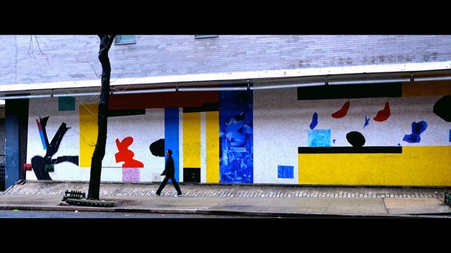
Although Hans Hofmann was a prolific and respected modern artist, his greatest talent might have been teaching rather than painting. He influenced a generation of American artists, mentoring students such as Helen Frankenthaler, Lee Krasner and Frank Stella. Louise Nevelson studied Cubism and abstraction with him in Munich. Jackson Pollock was particularly inspired by his 1940 painting “Spring,”created by dribbling, splashing and pouring paint directly onto his canvas which influenced Pollak’s own drip technique. Hofmann’s exploration of the spontaneous act of gestural painting was pivotal to the development of Abstract Expressionism, the only international art movement to begin in the United States. But perhaps the strongest testimony to Hans Hofmann’s talent is the fact that he still gives art lessons today, more than 20 years after his death.
The students of the High School of Graphic Communication Arts learn from him everyday. They view his mural, “Abstraction,” one of the two Hofmann designed for New York City, on the wall of the school building located at 439 W. 49th St between Ninth and 10th Avenues. It is well cared for, one of seventeen that the Municipal Art Society pledged to preserve in 1991. Hofmann designed “Abstraction,” which was executed by L. Vincent Foscato in 1958, when the high school was called the New York School of Printing. He referred to the mural, 64 feet long and 11½ feet high, as “the bowtie on the building.” Its vivid patterns and spirited presence live up to Hofmann’s description of it. It displays characteristics strongly associated with Hofmann’s work: bold contrasts of color, form, and texture, the results of an theory and technique he called “push and pull.”
Born in Weissburg, Bavaria in 1880, Hoffman grew up in Munich. He originally studied science and mathematics, but by the age of 18, entered art school, studying Impressionism and Pointillism. A patron supported him as an artist in Paris, where he met Georges Braque, Pablo Picasso and Fernand Leger, whose work shaped his ideas and style. Hofmann opened his own art school in Munich, which became well known around the world. Invited to teach in the United States, he immigrated to the United States and ultimately opened the Hans Hofmann School of Fine Arts in 1933. Hofmann continued to teach until 1958.
As exuberant as his work is, Hofmann held tightly to several rules for painting. Chief among them was his strong belief that an artwork’s meaning should be important to the creator. His mural “Abstraction” still has meaning today, particularly to the current students at the High School of Communication Arts.
– Alison Brown, Carol Cofone
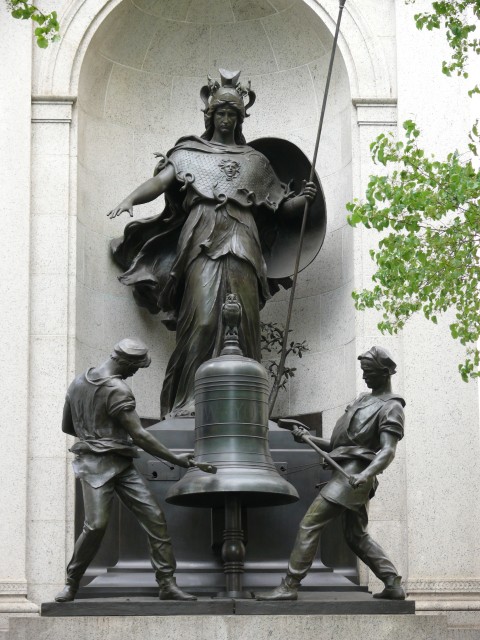
It’s been an arduous journey for Minerva, Stuff and Guff, and the three owls who comprise the James Gordon Bennett Memorial. Located at 35th St and 6th Avenue, at the north end of Herald Square, these bronze statues honor the man who led the New York Herald, the now defunct but once most sensational and widely read newspaper in the country. They were commissioned in 1895 by his eccentric son, James Gordon Bennett, Jr. The statuary, created by French sculptor Antonin Jean Carles, evoke the work ethic of the newspaper industry. The Roman Goddess Minerva, decked out in her war regalia, stands for thinking power. She oversees two bell-ringers in leather work aprons, affectionately known as Stuff and Guff, though they only pretend to strike the bronze bell. (Two mallets hidden inside actually toll the hour up until 11 pm each day.) Three owls represent wisdom: two, with electrified blinking green glass eyes, seated on the monument’s pilasters; one perched atop the bell itself, impervious to its chiming.
At one time, they all sat atop the New York Herald Building, adjacent to the square where they are now located. But in 1921, after the death of the eccentric, Bennett, Jr, the Herald Building was demolished. Minerva and the Bell-Ringers were removed, stored, acquired by New York University, “permanently loaned” to the New York City Parks Department and ultimately installed on a 40-foot-tall Italianate granite structure by Aymar Embury, in Herald Square, on November 19, 1940.
Since then, the Municipal Art Society has come to their rescue twice. In 1989 they restored the memorial through their Adopt-a-Monument Program with the help of the International Herald-Tribune and Mastercard. In 2007, a generous grant from the George Trescher Fund enabled the Municipal Art Society, the 34th Street Partnership and New York City’s Clock Master, Marvin Schneider, to complete a two-month-long conservation of the entire monument including the clock. As a result, the bell-ringers continue to mark the waking hours of each and every day. But looking at the stately bronzes, it seems their work has barely taken a toll.
– Lily Herzan, Ali Houston and Carol Cofone
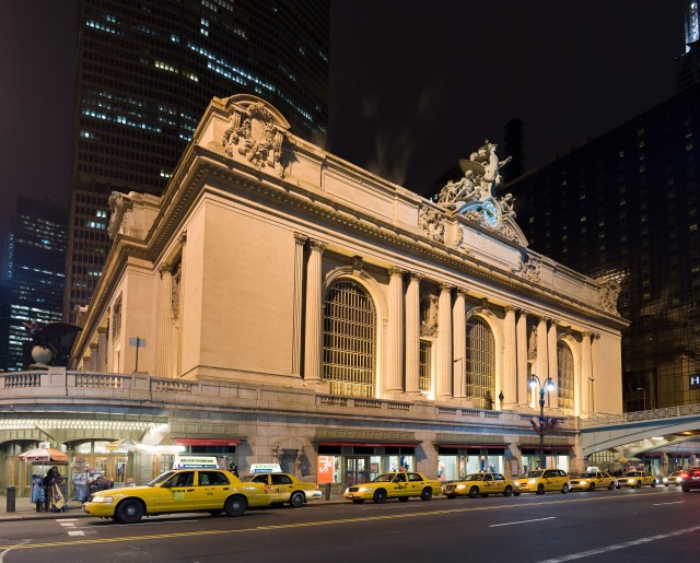
Holden Caulfield slept here. He didn’t like it.
“It wasn’t too nice. Don’t ever try it. I mean it.” By 1951, when Catcher in the Rye was published, this assessment of Grand Central Terminal, at 42nd St and Park Avenue, was not fiction. The original grandeur of the terminal, built 35 years earlier to house Cornelius Vanderbilt’s New York Central Railroad, had begun to fade.
Grand Central Terminal opened in 1913. It replaced the 1900 Grand Central Station with its glass and steel train shed, which itself had replaced the 1871 Grand Central Depot. The creation of the terminal – from inception, to design, to construction – was beset by controversy.
The inception was tragic. At the turn of the century, steam trains entered the station, above ground, via today’s Park Avenue. They were noisy, dirty and dangerous. On January 8, 1902, a train wreck occurred in a smoke-filled tunnel that killed 15 and injured 38. Outraged, some New Yorkers sought to indict the railroad’s board of directors, others to ban all steam locomotives in Manhattan or nationalize the railroads. In response, William J. Wilgus, chief civil engineer for the railroad, proposed to excavate 60 feet into the bedrock to create subterranean tracks, enabling electric trains to run below Park Avenue and enter the terminal below grade.
The design was contentious. The first plan, envisioned by the firm of Reed & Stem, represented Wilgus’ engineering ideas well but was thought “insipid” by William K. Vanderbilt, grandson of Cornelius. He recruited the firm of Warren & Wetmore to apply Beaux Arts aesthetics to the project. The two firms fought each other every step of the way: Warren & Wetmore influenced the facade, with its three arches, supported by pairs of Doric columns, crowned ultimately by Jules A. Coutans’ sculptures of Mercury, Hercules and Minerva. But inside, Reed & Stem’s innovative ramp system prevailed. Today it still gracefully leads to the concourse and its famous ceiling mural of the zodiac by Paul Helleu.
The construction created a whole new set of contradictions. Once the electrified tracks were buried below street level, rights to the “air” above were leasable to developers. In 1975 those air rights created a crisis. The railroad sought to sell them after a state judge invalidated Grand Central’s landmark status, and a developer advanced plans to build a skyscraper above the terminal. With the city nearing bankruptcy and fearing lawsuits, Mayor Abe Beame declined to appeal the ruling. Enter the Municipal Arts Society. They staged a vigorous dissent that was joined by former First Lady, Jackie Kennedy Onassis. She wrote a famous letter that is credited with saving Grand Central. It read “Dear Mayor Beame…is it not cruel to let our city die by degrees, stripped of all her proud moments, until there is nothing left of all her history and beauty to inspire our children?” According to Kent Barwick, president emeritus of the Municipal Arts Society, she also wrote about “how President Kennedy loved Grand Central Terminal.”
That part may be fiction, but the truth is that the letter saved Grand Central – the mayor appealed, landmark status was reinstated and in 1989 the terminal was fully restored. But you still shouldn’t sleep there.
– Carol Cofone
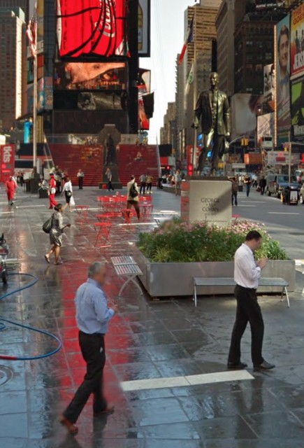
The Times Square Pedestrian Plaza, the remarkable cityscape completed in 2015, with its large red staircase, permanent granite benches and cafe tables and chairs, is a great place to sit. But two notable figures stand there all the time: the bronze statues of Father Francis P. Duffy, army chaplain during the Spanish American War and World War I, and George M. Cohan, the producer, playwright, actor and composer of “Over There,” the World War I standard.
Father Duffy is best known for his tours of duty with the legendary Fighting 69th Infantry. In Europe during World War I, he ministered to soldiers engaged in battle, and became the most highly decorated cleric in the history of the United States Army. When he died in 1932, a movement began to honor him. As a result, a statue of him, designed by sculptor Charles Keck was unveiled on May 2, 1937. It stands at Broadway and 46th Street, facing towards Holy Cross Church on West 42nd Street, where Duffy was once a pastor. The statue, which honors his service to church and country, depicts him standing before a granite Celtic Cross, holding a bible and wearing the uniform of the 69th. In 1939, the square where the figure of Father Duffy stands was named for him.
Quite a few years later, he was joined by the figure of George M Cohan. Cohan enjoyed a career on Broadway that spanned more than 40 years. During that time, he produced a succession of hit shows and composed a string of hit songs, including “Give My Regards to Broadway.” His patriotic songs earned him the Congressional Medal. He was the first person in an artistic profession to be so honored. When he died in 1942, it was not surprising that the theater community wished to honor him. However, it took the leadership of Oscar Hammerstein II, the composer, to make his memorial a reality. In 1956, plans for a statue were announced. The 8-foot, 7-inch bronze, designed by Georg John Lober, stands on a granite pedestal and base, designed by Otto Langman. It was dedicated September 11, 1959 and stands at the square’s southern end.
It should be noted that Duffy and Cohan were not the first to occupy Times Square. A 50-foot, eight-ton plaster statue of Purity (Defeat of Slander), created by Leo Lentelli, which featured an inscription that warned against speaking ill of New York, stood there in 1909. But if you wanted to see it, you would have had to look fast. It became such an object of derision and parody, the statue moved out in less than two months.
Other features of Duffy Square have changed over time. Most notably, in 1973 the first TKTS booth, selling discounted theater tickets, opened. It was reinvented in 2008 by the Theatre Development Fund as that glowing red glass staircase, ascending directly behind Father Duffy. From those steps, one can watch the full “cast” appearing daily in the new Times Square Pedestrian plaza – including the costumed characters, and yes, their less costumed counterparts, the desnudas who wear only body paint to attract the attention of visitors. Many of those seated remain unmoved. But not Duffy and Cohan, who give everyone in the Times Square Pedestrian Plaza a standing ovation.
– Lily Herzan, Ali Houston and Carol Cofone
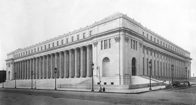
The James A. Farley Post Office was designed in 1912 by McKim, Mead and White, the architects that completed Pennsylvania Station in 1910. The Beaux-arts building was similar in style to the old Pennsylvania Station, and stands today as a reminder of the past. The post office is named for the 53rd postmaster James Farley, who was a noted businessman and politician.
One of Farley’s most well known features is the prominent inscription “Neither snow nor rain nor heat nor gloom of night stays these couriers from the swift completion of their appointed rounds.” This quote is often mistaken as the official creed of the US Postal service. It was actually chosen by the architectural firm McKim, Mead & White, the architects who designed the Farley Building and the original Pennsylvania Station. It derives from a quote from ancient greek historian Herodotus, and refers to the courier service of the ancient Persian Empire. The United States Postal Service actually has no official creed or motto.
Directly inside the post office rests two murals by artist Louis Lozowick entitled “Triboro Bridge” and “Lower Manhattan.” The art-deco murals were WPA commissions completed in 1936. The murals sat in the post office lobby – which was open 24 hours a day until 2009 – and were subjected to the brutal winters, air pollution and hot summers. The murals were in severe disrepair in 1998, when the Post Office facilitated their $300,000 restoration. The murals were cleaned, chipped paint was filled, and they were given a new coat of varnish. When re-installed, the murals were hung ¾ of an inch from the wall, so as to preserve them from further deterioration.
Today, the Farley Post Office is undergoing the first phase of a plan to transform the Post Office into Moynihan Station, a new train station that would alleviate Penn Station congestion. MAS has been advocating for the creation of Moynihan Station for years, and continues to push the project forward today.
| sight | Pennsylvania Station |
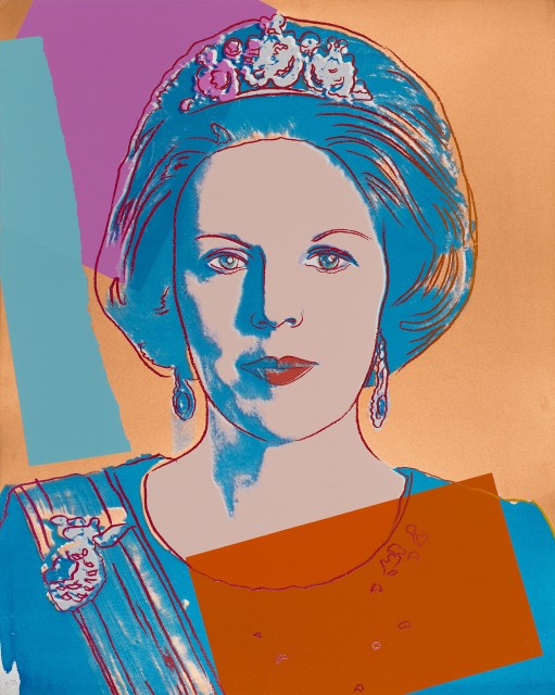
In America , we have no royalty. But if you’d like to visit with a queen, you can find Queen Beatrix of Netherlands in the midtown “living room” of the citizenM Hotel in Times Square. The hotel was created by Rattan Chadha. Irked by the modern day travel frustrations, he wished to create a luxury hotel experience at affordable prices. Key to that was transforming the hotel lobby from a “place to wait for the rain to stop” to a “third space,” a lobby-cum-living-room, where guests feel included and comfortable. And inspired. It displays a mix of artwork by local artists, as well as pieces from Chadha’s own large private collection.
That is how a screen-print of Queen Beatrix of the Netherlands came to be housed in the Times Square location of citizenM home. It originated from Andy Warhol’s 1985 Reigning Queens, a series comprised of portraits of four women who gained their titles by birth rather than marriages. Queen Elizabeth II of the United Kingdom, Queen Margrethe II of Denmark and Queen Ntombi laTfwala of Swaziland are the other subjects in the series.
As you would expect of a Warhol, this interpretation of Queen Beatrix is a departure from standard royal portraiture. It relates more to the world of disco and Studio 54 than to the regal sphere of the Dutch monarch. Reigning Queens, the title of the series, connects the pictures to Warhol’s earlier series of Drag Queens as well as a 1982 disco hit, “It’s Raining Men.”
In so doing, it placed the Queen of the Netherlands in the hierarchy of pop culture, along with the other artists, stars, transvestites and socialites who were Warhol’s subjects. Ultimately it placed her in the lobby-cum-living room of the citizenM hotel – an adventure in egalitarianism no matter how you look at it.
– Carol Cofone
| sight | Andy Warhol's High Security Factory |
| sight | Andy Warhol's Second Factory |
| sight | Mudd Club |
| sight | Max's Kansas City |
| tidbit | Moon Museum |
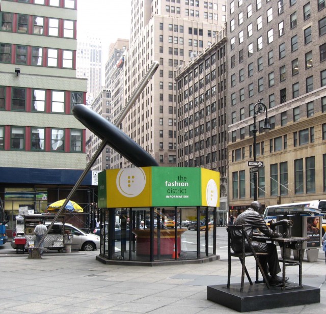
On Seventh Avenue, between 39th and 40th Street, a 31-foot stainless steel needle stands: It rests on its 2-foot eye that pierces a woven steel swatch of fabric in the sidewalk, and points upward to a 14-foot button that it pins. The display, designed by Pentagram Architectural Services in 1996, and inspired by Claes Oldenburg’s sculptures, leans atop the Fashion Center Information Kiosk. Standing there, it’s impossible to ignore the fact that you’re in the Garment District.
However, without the oversized clue this art provides, you might not be able to tell at all.
Much has changed in the Garment District, which occupies roughly 32 square blocks of the west side, between 34th and 42nd Streets. In the 1850’s, a time when most people made their own clothes, or had them custom made, the Garment District created a new industry of ready-made clothing. The commercial opportunity resulted from the sad economics of the Civil War era – large numbers of immigrants in New York were put to work, mass producing cheap clothing for slaves in the south. It was more productive to devote slave labor to the business of the plantation than to the making of their own clothes. The industry grew rapidly and countless warehouses, offices and factories sprung up (not just in the Garment District, but other areas of the city as well) to support the industry. By 1910, ready made clothing suited the nation at large, with New York manufacturing 40% of men’s clothing and 70% of women’s clothing in the United States. The fashion district teemed with men pushing racks of clothing through the streets.
Today, few racks are rolling. The industry has fallen into deep decline. While the fashion industry is still important in New York City, accounting for 4.6% of nationwide fashion employment, manufacturing jobs have moved off-shore. Despite special zoning laws designed to keep manufacturers in place, much of the real estate is now residential or office space – notably the new New York Times Tower stands in the place of a building, now demolished, that once housed garment industry businesses. In an effort to revitalize the industry a 2010 Municipal Arts Society initiative showcased the competitive advantages of manufacturing in Midtown to encourage new creative enterprises to return and re-thread the needle.
— Carol Cofone
| 1800 | Rise of Garment Industry in New York |
| 1910 | 40% of men’s clothing and 70% of women’s clothing produced in New York |
| 1960 | Decline of the Garment District |
| 1996 | Fashion Center Information Kiosk designed by Pentagram Architectural Services |
| wiki | Fashion Disctrict |
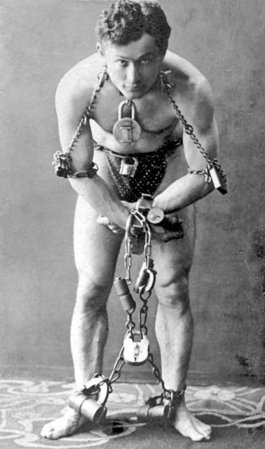
The famous illusionist, Harry Houdini, originally Erik Weisz or Ehrich Weiss, is perhaps best known for his escapes. In 1894, he and his wife, Bess, thrilled audiences at Huber’s Opera House with a trick called the “The Metamorphosis Miracle.” It worked like this: Houdini, hands bound behind his back and tied in a sack, was locked in a wooden trunk while Bess stood on top of the trunk, hidden by a screen. On the count of three, the screen was removed and there was Houdini standing on the trunk, with Bess inside, hands bound behind her back and tied in a sack. Applause.
Today, you can see the Metamorphosis Substitution Trunk on display, at The Houdini Museum of New York, located within the headquarters of Fantasma Magic, on the third floor, at 421 7th Avenue. The museum has more than 1500 pieces, including several hundred rare items that he used or owned, many never previously displayed. Among them is an artifact with a history of disappearance to rival Houdini’s own: his bust.
Or at least one of his busts: the original bust of Houdini was made of bronze by John Cassidy of Manchester England. Houdini left specific instructions in his will that it should be displayed at his gravesite. When he died of appendicitis on Halloween in 1926, his wishes were carried out, up to a point. His wife brought it to the Machpelah Cemetery, in Queens, but it remained there only temporarily. A marble copy was made and installed so the original could be donated to the Museum of the City of New York. Unfortunately, the marble replacement was destroyed, either on purpose or accidentally by fans of Houdini in 1975. A second replica, a polyethylene resin model made by the Society of American Magicians to replace the smashed marble bust, was made in 1976. But it was stolen on August 15, 1983 – and disappeared for the next 19 years.
But there’s a surprise ending: In the first week of March, 2002, while responding to an unrelated complaint, police found the head of Houdini in a basement in New Hyde Park, 12.5 miles from the cemetery. The long missing bust went on display at the Houdini Museum, courtesy of the Society of American Magicians.
Applause.
— Carol Cofone
| 1874 | Erik Weitz is born in Budapest, Hungary. |
| 1904 | Houdini takes up residence at 278 West 113th Street, |
| 1926 | Houdini dies in Detroit, |
Welcome to the sixth annual MAS Summit for New York City! It’s time to take your place among more than 1,000 attendees, 100 speakers, 800,000 online participants to hear more than 60 dynamic talks, all to envision The City We Want!
We at the Municipal Arts Society are here to help you get the most out of these sessions, and out of your stay. That is why we have provided you with this innovative Float Traveler app. It can help you experience New York City in a whole new way.
As you may have noticed as you opened it, It geolocates you, and identifies all the points of interest that surround you. Touch any point, and an original story about the city’s architecture and art, or history and heritage, unfolds in the palm of your hand. By seamlessly integrating the navigation of the street and the appreciation of the cultural artifacts located on it, Float connects you to the city, weaving the stories into a native intelligence.
MAS has collaborated with Float to identify and create the stories that are most interesting to urbanists like you. Feel free to use Float to explore all the compelling sights within walking distance of the Times Center, as well as the ones that intrigue you the most in the city at large.
It will be easier to envision The City We Want once you’ve had a chance to explore The City We Have!
We’d love to hear about your experiences exploring the city with Float. Please share your comments by visiting mas.org/linkTBD
| link | MAS Summit Schedule |
| link | Contact Us |
| sight | Times Center Google Map |
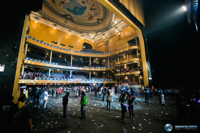
Hear the words “Hammerstein Ballroom” and you will likely think of Oscar Hammerstein II, the writer and producer who made a fortune by producing musicals on Broadway. But you’ve got the wrong guy. The Hammerstein Ballroom, part of the Manhattan Center, an event venue at 311 West 34th Street, between 7th and 8th Avenue, was named for his grandfather, Oscar Hammerstein I who ironically made a fortune by not producing operas.
Oscar I was a cigar magnate and prolific builder of theaters, including the one that houses the ballroom. He built it in 1906. It was known then as the Manhattan Opera House. He built it for his Manhattan Opera Company, a popularly priced alternative to the costly Metropolitan Opera. Its affordable tickets proved popular indeed – resulting in a net loss for the Metropolitan Opera during the 1906-07 season. So in 1910, the Met decided to buy up all the tickets. It paid Hammerstein the enormous sum of $1.25 million ($695 million in today’s dollars) to stop producing operas at the Manhattan Opera House for ten years. With Oscar’s many projects seriously straining his finances, he accepted the offer. He briefly tried other acts, but in March of 1911, he sold the opera house to the Shubert brothers. They staged vaudeville acts during the week and concerts on Sunday nights.
Oscar I died in 1919. The Manhattan Opera House lived on, though in many different guises. It was purchased by the Ancient Accepted Scottish Rite of Freemasonry in 1922. The building was renamed Manhattan Center in 1940, and became a hotspot for “big band” dances as well as trade shows, union meetings and other social functions. There were radio broadcasts, recordings, and performances by a range of artists, from Harry Belafonte to Bob Marley, from Leonard Bernstein to The Grateful Dead, over the years.
It fell into disuse until Sun Myung Moon’s Unification Church bought it in 1976. Name changes ensued: the building was renamed Manhattan Center Studios in 1986. The theater inside became the Hammerstein Ballroom in 1997. Its box seats, balconies and proscenium arch were restored. Its 75-foot frescoed ceiling was recreated altogether.
The subject of the original fresco was an orchestra of angels. Alistair Farrant, an audio engineer, executed it as an oil painting on 16 canvases, and in so doing, added his own touch. He changed the ethnicities of some of the angels to mirror the diversity of today’s New York City. Turning to co-workers at the Manhattan Center for inspiration, he depicted an African American security guard as a violinist, and an Asian-American receptionist as an angel. Oscar would likely be gratified to see his opera house as home to an ever wider audience.
— Carol Cofone
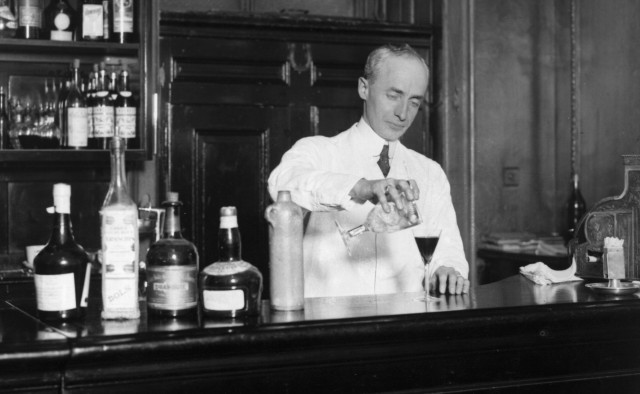
Although everyone seems to know how to make a martini – each advocating their own perfect ratio of gin or vodka to vermouth – no one seems to know who made it first. There are three contenders:
One: A Signore Martini from Arma di Taggia, a bartender at the Knickerbocker Hotel during the 1910’s in New York,
Two: Jerry Thomas, a bartender at the Occidental Hotel in San Francisco during the 1850’s and 60’s and
Three: Johann Paul Aegius Schwartzendorf, a German musician who emigrated to France in the 1750’s
Let’s begin with the bartender at the Knickerbocker Hotel, Signore Martini from Arma di Taggia in Italy. Italian sources say that this immigrant was hired by the Knickerbocker and in 1910 mixed gin and vermouth in honor of John D. Rockefeller. There are problems with this story – the greatest being the numerous published references to the drink that pre-date 1910. However, it may just be semantics: it is possible that the Knickerbocker bartender, the first to use dry white vermouth in place of sweet red vermouth, actually invented the dry martini. Really, is there any other kind?
Apparently, yes. Jerry Thomas, a bartender at the Occidental Hotel in San Francisco in the 1850’s and 60’s, is said to have mixed a drink for a prospector, about to set out on a journey to Martinez, California. Thomas combined one dash bitters, two dashes Maraschino (a liqueur distilled from Marasca cherries), one wine glass of vermouth, two small lumps of ice, one shot of a sweetened gin called Old Tom, and dubbed it the “Martinez,” in honor of the customer’s destination. Does a shot of gin overwhelmed by a wine glass of vermouth a martini make?
Which brings us to the third contender, Johann Paul Aegius Schwartzendorf, a German musician who emigrated to France in 1758 and changed his name to Jean Paul Aegide Martini. He became known for his favorite drink, a mixture of gin and white wine, which friends and devotees would order by his assumed name, Martini. Ostensibly, when those friends emigrated to the United States, they brought the drink with them. Of course, the distance between France and America is shorter than the distance between a concoction of gin and white wine and a definitive martini.
Let’s face it: a martini, as we know it, is six parts gin or vodka to one part vermouth. Perhaps the first person to enjoy this particular recipe couldn’t remember who had served it to him. So we’ll likely never know.
— Carol Cofone
| sight | Knickerbocker Hotel |
| sight | Old King Cole |
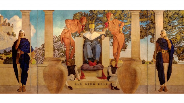
The jokes one hears in a bar have a way of getting around. There is no better example of this than the 30-foot oil painting, Old King Cole, commissioned by John Jacob “Jack” Astor IV in 1905. He asked Maxfield Parrish, illustrator, painter, and the most popular commercial artist in America during the early 1900’s, to paint it for the bar of the Knickerbocker Hotel at 6 Times Square. However, the artist, a principled Quaker, was reluctant. Therefore, in a reportedly contentious negotiation, Astor upped the commission to the exorbitant price of $5,000.
At that rate, though, he wanted to be pictured in it – as the King, himself. It seems that Astor, at the time, had earned all the respect that money can buy: he went to Harvard, but left without a degree. He divorced his wife and, at 46, married a 17 year old. The press made fun of him, calling him “Jack Ass.”
Nonetheless, Maxfield Parrish acquiesced to Astor’s wishes – sort of. If you look closely at King Cole’s face you will see a good likeness of John Jacob Astor himself. But if you look closely at the faces of the courtiers and pages, you’ll see something else altogether. It is said that Parrish and the other well known artists of the day were having a contest to see who could essentially illustrate a fart joke in a work of art on public display. Judging by the expressions of the courtiers, Parrish won the contest. He himself denied it. When asked he said “My intentions when painting the mural had been 110 percent pure.”
This joke has made the rounds of several bars. And so has the painting itself. Although many refer to the “Old King Cole” as a mural, even Parrish himself, it was not painted directly onto the wall of the Knickerbocker bar. It’s actually three eight- by ten-foot paintings, which made its many changes of venue possible.
It started out in the bar at the Knickerbocker Hotel. But by 1921, after Vincent Astor, John Jacob Astor IV’s son by his first wife, turned the Knickerbocker into office space, it moved to the Racquet and Tennis Building at Park Avenue. In 1935, Vincent transferred the painting to another Astor property, the St. Regis Hotel at 55th Street and Fifth Avenue. In 1948, it was installed in the hotel’s bar, which was renamed for it. You can see it there today.
Of course, Parrish proved that a joke can be both funny and elegant. The painting’s glazing technique, a hallmark of his work, allows the light to pass through and then reflect back out, make it seemingly glow from within. Also, the color palette, distinctive to Parrish, is much in evidence here, particularly since its 2007 cleaning. In fact, the twelve-week, $100,000 restoration has truly dignified the King, fart notwithstanding.
— Carol Cofone
| 1904 | The St. Regis Hotel opened by John Jacob “Jack” Astor IV |
| 1905 | Old King Cole commissioned by Astor IV |
| 1912 | Astor IV dies on the Titanic |
| 1932 | Painting installed in the St. Regis Hotel’s bar |
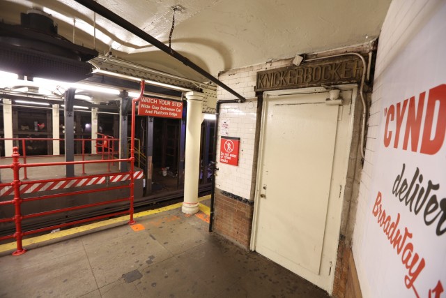
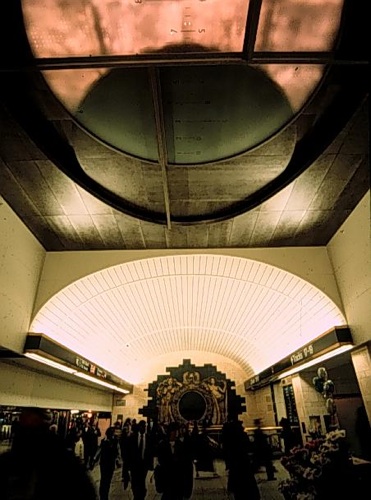
There is a door in Midtown Manhattan, located at the west end of the north Times Square Shuttle platform. Once upon a time, this platform was part of the original Times Square station. It is now the first stop, or last stop, of the shuttle to Grand Central. The word above the doorway, Knickerbocker, would seem an invitation to any New Yorker to enter. In 1906, it was.
Back then, the door opened into the Knickerbocker Hotel, a 15-story, redbrick and terracotta Beaux Arts beauty, built at a cost of $3.3 million. Its elaborate Second Empire design was a collaboration of Marvin & Davis, Bruce Price and Trowbridge & Livingston. Located at 6 Times Square, on the southeast corner of Broadway and 42nd, it was completed in October of 1906 for John Jacob Astor IV, (who later died in the Titanic disaster.) Astor’s enthusiasm for the subway, put in place only two years earlier, led him to create this platform access.
Had you walked through this door in those days, you would have entered an elegantly appointed passageway “furnished with settees and decorated with heraldic banners.” You might have joined the “constant stream of strangers through the lower floors of the hotel,” that reportedly had “to go see the heralded splendor of this newest Times Square building.” If you were a man, you might have entered the bar to enjoy a martini, supposedly invented there. However, if you were a woman who wanted to see to see Maxfield Parrish’s painting of Old King Cole, you would have had to settle for a peek from a distance. No women were allowed.
If you were to walk through that subway platform door today – and you most definitely cannot – you would not see anything too heraldic. The passage is largely in ruins. You might see the remains of some roundels on the columns, maybe a trace of gold stenciling here and there.
The MTA owns the passageway and uses it for storage. They have no plan to re-open the door.
— Carol Cofone
| article | NYTimes: Behind Subway’s Phantom Hotel Entrance, Neither Arias Nor Opulence Linger |
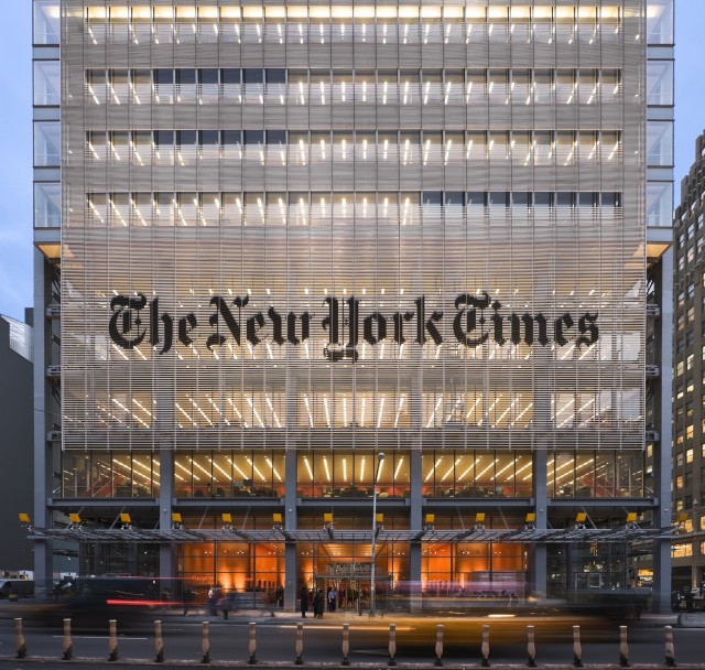
With the turn of the millennium, The New York Times was looking to build a new home for itself. The Times hadn’t built a tower since 1904, so Arthur Ochs Sulzberger, Jr., publisher and chairman, gave thought to the architectural message the Times wanted to send. Reportedly, it wanted to convey the journalistic values and democratic ideas of openness, integrity and transparency. Figuratively speaking.
Renzo Piano, the noted Italian architect and winner of the Pritzker Prize who was commissioned to design the New Times Tower, espoused the same values. But when it came to transparency, his expression was literal. The New Times Tower, at 620 Eighth Avenue, is enclosed in 748 feet (52 stories) of untinted, ultraclear, low-iron glass, wrapped in semi-see-through, heat-and-glare-deflecting ceramic white rods that run horizontally in front of the windows. The first building not built around the paper’s printing presses, it houses the business and executive staff.
Adjacent to the glass structure is Piano’s most notable design feature: the Podium, which houses the editorial staff. This separate, four-story glass wing looks out onto a courtyard of moss and birch trees. And the courtyard looks right back in.
The plan for each floor of the Podium, five or six times larger than that of a typical office building, seats the entire news operation on just three levels. Glass-enclosed, multilevel interconnecting stairways, running along the facade, can be seen inside and outside the building. Executive offices and conference rooms are glass faced. On the third floor, the news desk, is centered below a two-story interior atrium with a skylight.
Critics say this workspace is more sophisticated than any the Times has ever built. But perhaps a little sophistication goes a long way: One member of the editorial board, who traded an enclosed office at the Annex for a fishbowl at the Tower, complained, “There’s no place I can change into a tuxedo.” One editor struck a blow for privacy. He placed a frosted pane inside his glass-walled office.
Here’s the thing about being transparent: people can see through you. Failures of transparency related to the New Times Tower were apparent even before the groundbreaking. For the tower to be built at all, it was necessary for the state-controlled Empire State Development Corporation (ESDC) to impose eminent domain. Under the terms of a 2001 deal with the city and the state, it took property from owners who did not wish to sell. In a true irony, in order to take the property the ESDC had to prove that the area was blighted. The New York Times, itself, said in a 1997 article related to Reuter’s subsidies for its Times Square building, “blighted is not a word anyone would use to describe Times Square today.”
So as The New York Times operates out of its elegant glass house, it’s up to its readers to read between the lines—and peer between the rods—to find any criticism of sweetheart real estate deals or corporate favoritism in the city of New York.
– Carol Cofone
| sight | NYTimes: Moving Stories |
| sight | NYTimes: The Signs of the Times |
| sight | NYTimes: All Centuries Come to an End |
| sight | Moveable Type |
”This is not the building to go into the next century with.”
So said Arthur Sulzberger Jr., the publisher and chairman of The New York Times, referring to the Times Annex, located at 229 West 43rd Street, between 7th and 8th Avenue. He was explaining the reasons why the newspaper would be leaving it and building The New Times Tower.
Actually, The Times Annex was the building to go into the last century with. It opened on February 2, 1913, a few short years after The New York Times had moved into The Times Tower at 1 Times Square in 1905. The Tower, an homage to Giotto’s Campanile in Florence, had narrow floors and never provided an ideal physical plant for the paper. So the Annex at 229 West 43rd Street was conceived as more of a factory. Designed by Albert Buchman and Mortimer J. Fox, it had eleven stories above street level and a spacious pressroom and sub-basement below. It contained 144,000 square feet of space‒three times the space of the old building. It housed huge printing presses‒seven times the paper’s previous capacity. It featured 19 truck bays. Though it was built out of the same materials as the Times Tower at 1 Times Square and featured French Gothic flourishes borrowed from the Château de Chambord, it was not ostentatious. It was only 321 feet tall. The name of The New York Times chiseled over the entrance to 229 West 43rd Street was only six inches high. The Times boasted of the building’s workmanlike character, calling it “the greatest and completest newspaper workshop in the world.”
In this building, form anticipated function. It was engineered with future expansion in mind. In 1921, circulation reached 313,000, triggering the building’s first renovation. Architects Ludlow & Peabody created a 100-foot, 11-story extension on the west side, a four-story “attic,” and seven-story setback tower. They carefully designed and engineered the expansion to serve the daily flow of news and newspapers. Every floor, including the third floor designed for editors and reporters shown in this blueprint, was designed to serve the functions of the paper,.
Two more add-ons came later, one in 1932 by the prolific Detroit architect, Albert Kahn, and another in 1947 by Shreve, Lamb and Harmon, architects of the Empire State Building, to achieve the paper’s own manifest destiny, extending it to 44th Street and increasing its overall size by 61 percent.
Of course, all centuries come to an end. So did the Annex’s capacity for expansion. An elegant new building to house printing operations, designed by Polshek & Partners (now known as Ennead Architects), was built at College Point, Queens in 1997. The New York Times printed its last daily paper in the Annex on June 15 of that year. It wrote and edited the paper for the last time at the Annex on June 9, 2007.
— Carol Cofone
| sight | NYTimes: Moving Stories |
| sight | NYTimes: The Signs of the Times |
| sight | NYTimes: A Glass House |
| sight | Moveable Type |
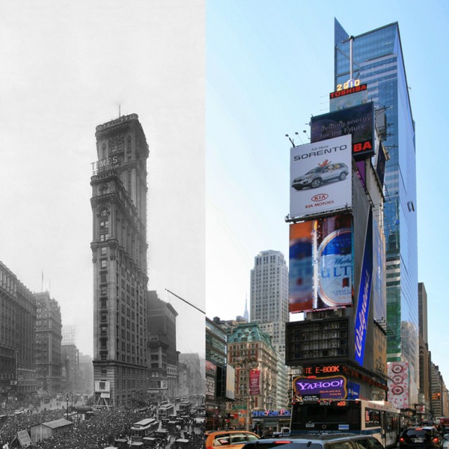
In 1905, the New York Times moved to midtown from its downtown location primarily because it needed more space. It chose 1475 Broadway at 42nd Street as its new home, partly to one-up its competitor, The New York Herald, located at Herald Square since 1895. But partly it wished to take advantage of the unique geometry of Broadway’s intersection of the midtown grid. It afforded the opportunity to design a building to fit the plot of land at that location. The Times Tower was modeled after Giotto’s 14th century Campanile in Florence.
Today you’d be hard put to notice any resemblance.
The Times Tower opened in Times Square on December 31, 1904, with fireworks at midnight. But less than ten years later, the Times needed even more space. In 1913, it moved some of its operations to the Times Annex at 229 West 43rd Street—which it then expanded. And then expanded again. By 1963, with the Times operating out of the Annex and its printing plant on West End Avenue, the building was sold.
It was renamed the Allied Chemical Tower, for its new owner. When the corporation stripped the building of its architectural detail, replacing it with a corrugated cement and marble cladding, Ada Louise Huxtable, architecture critic of the Times, cited it, along with the demolition of Penn Station, as another sign of an “impoverished society.” She called it the “lowest common denominator of non-design.” She may have spoken too soon.
When the tower was sold in 1995 to Lehman Brothers, instead of leasing the interior, they turned the exterior into a billboard. They sacrificed any vestigial resemblance to Giotto’s Campanile, but made a 300% profit in two years. Sherwood Outdoor and Jamestown One Times Square, who acquired the building in 1996, continued this business model. Today, despite leasing the first three floors to Walgreen’s, and some minimal use of space above that for storage, the building’s most viable commercial purpose is to support electronic and vinyl signs and the annual New Year’s Eve ball drop. The building yields revenues of $23 million a year.
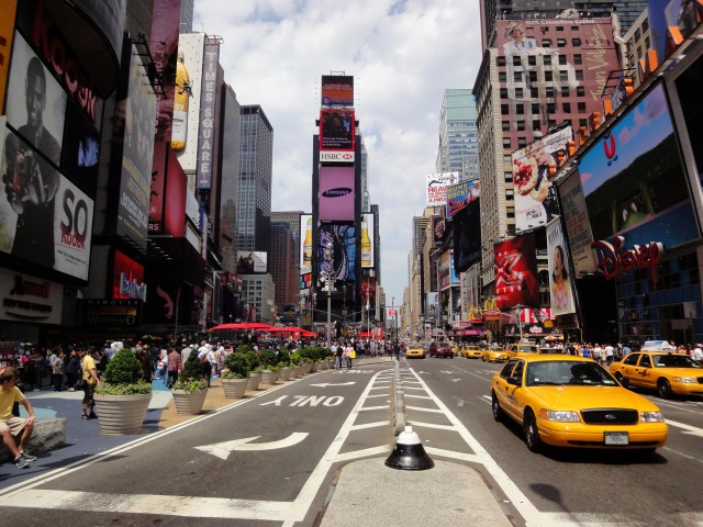
The value of those signs to Times Square is more than just monetary, as New Yorkers discovered on the evening of November 7th, 1984. The Municipal Arts Society staged a protest called “Shut Off the Lights” during which all the commercial signage in Times Square went dark at the same time. In so doing, they helped defeat a proposed rezoning that could have turned Times Square into “just another Sixth Avenue” (see minutes 6:20 to 7:40). Subsequently, zoning for Times Square’s “Special Midtown District” made it mandatory for every building in Times Square to have a billboard. Today you’ll recognize Times Square by the signs all over it, but not by the buildings within it.
– Carol Cofone
| sight | NYTimes: Moving Stories |
| sight | NYTimes: All Centuries Come to an End |
| sight | NYTimes: A Glass House |
| sight | Moveable Type |
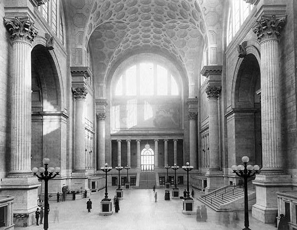
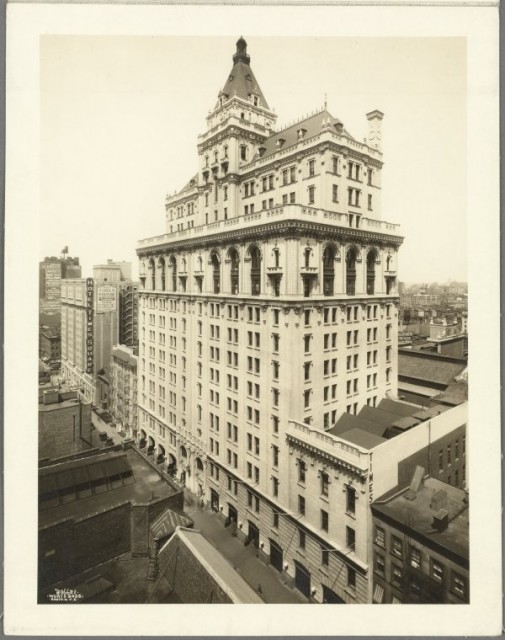
In New York, all travelers rushing to Pennsylvania Station to catch a train are missing something. When they arrive at the block between 7th and 8th Avenue, from 31st to 34th Streets, they are greeted by the squat rotunda and nondescript tower of Madison Square Garden, designed in 1963 by Charles Luckman. What they have lost forever is the original Penn Station. Built in 1910 by Charles Follen McKim of the famous firm, McKim, Mead and White, it was designed to exalt the rail traveler. Intended to stand for centuries, it was razed in 1963. Its tracks and platforms, well below grade and still in use by Amtrak, the Long Island Railroad and New Jersey Transit, are all that remain.
The original Penn Station, with its 84 Doric columns, glass ceilings and soaring vaults inspired by ancient Roman Baths, was a beaux arts masterpiece. McKim, picturing well-gowned women sweeping up and down its broad staircases, created “a monumental gateway and entrance” to New York City. It was part of a masterplan of the Pennsylvania Railroad, the world’s largest corporation in 1900, to provide direct transportation into Manhattan. However, by the late 1950’s and early 1960’s, the railroad was facing financial ruin, a result of years of government regulation and competition from automobiles and airlines. The problem, as the architectural historian Lewis Mumford noted, was that “spatial magnificence…is a luxury that pays off only through the centuries.” The Penn Central didn’t have that kind of time. Therefore, they sold their air rights and a long-term lease to Madison Square Garden. Despite the protests of the Action Group for Better Architecture in New York (AGBANY) – five architects and 175 picketers, including the preservation activist Jane Jacobs – the station was demolished.
Perhaps Penn Station’s fate was sealed from the beginning. Contrary to Vincent Scully’s famous remark “One entered the city like a god,” for most, the daily grind of entering and exiting the city was rarely divine. So, as Ada Louise Huxtable, architecture critic for the New York Times, said, we ended up with what “we want and deserve, tin-can architecture in a tin-horn culture.”
Today, the Municipal Arts Society is suggesting we deserve better. It is advocating for the relocation of Madison Square Garden. It is fighting for the building of a new Penn Station by 2023 to alleviate immense congestion and provide for future growth. It is supporting the creation of the Moynihan Station across the street at the Farley Post Office.
If you find yourself in today’s Penn Station you may catch only a glimpse of its former glory: an isolated brass newel, here; a bronze banister, there. Unless you check out the Waiting Room of the Long Island Railroad, in between the ticket windows and the escalators on the lower level of the station. There you’ll find a large piece of the old station, uncovered during a 90’s-era renovation. Step through its steel and glass entryway, with its original, elegant foliage pattern. There you might be transported to an era of grace and style, which is a good deal further than the railroad will take you.
— Carol Cofone
| sight | Farley Post Office |
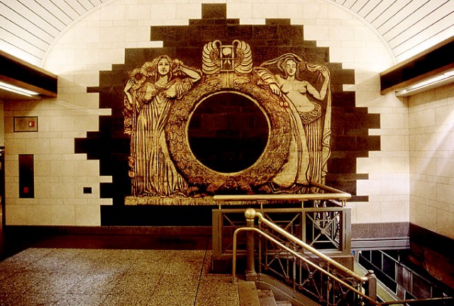
Andrew Leicester’s Ghost Series consists of five monumental bas-relief terra cotta murals installed throughout the Long Island Rail Road station. The pieces evoke the building’s illustrious predecessor, the 1910 Pennsylvania Station building by McKim, Mead and White that was demolished in 1963, an event that triggering the historic preservation movement. Fragments of the old Penn Station are hidden in the lower depths of the building that replaced it, and the murals symbolically reveal the old building now hidden behind new walls.
In Day and Night, a 500-square-foot-mural in the main concourse, Leicester reinterprets Adolph Wineman’s sculpture of the same name that presided over the old station’s entrances, depicting two women flanking a gigantic clock. The artist embedded the date the original building was demolished – 10/28/63 – into the clock’s blank face. Other murals include Mercury Man, a reproduction of another sculptural figure, and a porcelain-on-steel rendering of blueprints for the demolished building. Taken together, Ghost Series is a compelling memento mori – a reminder that we are mortal.
| internal | gDoc TBC |
| internal | MTA Arts and Design page |
In Eclipsed Time Maya Lin tries to get commuters to think differently about time and trains. “I’m asking for a one-on-one relationship between the viewer and the work,” the artist says. The large metal sculpture, installed overhead in the Long Island Rail Road’s main concourse at Penn Station, combines industrial craftsmanship with contemporary technology to tell time. “When people think about clocks they usually envision hands or digital numbers,” explains Lin. “Time is measured mathematically and specifically. I wanted to reflect time naturally and chose to use the concept of an eclipse.” To create this effect, a solid disk hangs between the light source and a stationary glass disk. Light shines through the glass disk, illuminating the rotunda below. The solid disk travels from east to west and back. An eclipse is created at midnight, as the two disks are aligned and only a penumbra of light shines around the aligned circles. The cycle is repeated daily.
| internal | gDoc TBC |
| internal | MTA Arts and Design page |
| internal | CultureNow |
A green painted rectangular structure is suspended from the subway platform and engages travelers with its ability to produce sounds. Travelers place their hands in front of the box-like apparatus on the subway platform and a burst of musical notes are released on the opposite side, playing to the person on the other side. The hand motions elicit an outpouring of sounds that evoke urban life and bring about duets between strangers waiting for their respective trains. This work brings about interaction and pleased participants, serving in Janney’s words, as “a foil for getting total strangers to interact with each other.”
Artist Christopher Janney creates sound sculptures and public art that use sound and motion. He has created a number of permanent and temporary instillations in the US and Europe. Janney also has a series of Soundstairs (stairs that create sounds with each step) in various American cities.
edited from MTA Arts & Design
| internal | gDoc TBC |
| internal | MTA Arts & Culture |
| internal | Wikipedia: Christopher Janney |
| internal | CultureNow article |
42nd Street Ballroom was one of George Rhoads’ first audio kinetic sculptures. The 8 x 8 x 8 plexiglass and steel cube located in Port Authority Bus Terminal is filled with pool balls, chimes, motors, pumps, a moving saw blade, and other mobile objects. In 2010, the piece underwent repairs after it had stopped functioning.
| 1983 | 42nd Street Ballroom installed |
| link | George Rhoads |
| internal | CultureNow |
| internal | Waymarking: 42nd Street Ballroom |
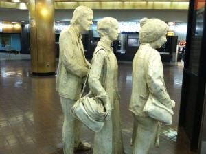
George Segal’s Port Authority “Commuters,” much like the figures in his “Gay Liberation Monument” in Christopher Square in the West Village, are plaster casts of real people. The first figure is his wife Helen, the other two are former student George Kuehn, and his wife Carol.
To make these sculptures, Segal casted each of his models’ bodies section by section with plaster bandages. After it had dried, each section was removed and reassembled, which could take up to six months to complete. The plaster figures were then cast in bronze and given a coat of graffiti-proof paint, which creates a protective surface that paint cannot bind to. Both the clock and door that the figures face were salvaged from Port Authority’s 1980’s renovation. Segal had the hand of the old departures clock removed, putting the commuters in perpetual limbo.
Though some travelers passing through the station saw the sculptures as a form of mockery for their constant traveling, Segal viewed commuters as heroes. “These are long-suffering people,” he said. “I have a high regard for them.”
| 1982 | Commuters installed |
| sight | Gay Liberation Monument |
| internal | George Segal - Wiki |
| internal | Sculptor George Segal's Model Commuters Are a Study in Terminal Patience |
| sight | The George and Helen Segal Foundation |
Under the lights, temporary art exhibitions, and hordes of tourists that fill Times Square, there is a sculpture you might not notice. Unlike the other sculptures on ArtWalk, this one cannot be seen – only heard. Max Neuhaus’ sound sculpture, “Times Square,” is an unmarked site-specific installation of sound art. Neuhaus first installed it in the subway tunnels in 1977. The recording uses the resonance of the tunnel to amplify the sound. Neuhaus unplugged the sculpture in 1992, but it was reinstalled in 2002 with funding from the Dia Foundation, MTA Arts for Transit, and the Times Square Street Business Improvement District.
| 1977 | Times Square installed |
| 1992 | Neuhaus disconnects Times Square |
| 2002 | Neuhaus reinstalls Times Square |
| article | Something Fresh Wafting Up From a Times Square Grate: Art |
| internal | Max Neuhaus |
| link | Max Neuhaus' Times Square |
| internal | gDoc |
Athelstan Spilhaus’s “Sun Triangle” brings a scientific instrument to Midtown. Spilhaus, a geophysicist and meteorologist, designed and installed the sculpture so that the edges of the triangle would line up with the sun on equinoxes and solstices. On the summer solstice, the sun appears at the top of the triangle’s short side; in winter, it aligns with the lower leg. And on the first days of fall and spring, the sun lines up with the longest side of the triangle. Spilhaus was instrumental in bringing science to popular culture; his comic strip “Our New Age” explained scientific ideas, and was published from 1958 to 1973. He also joined with the architect Buckminster Fuller in an attempt to make the futurist “Minnesota Experimental City,” which was never built. Spilhaus contributed to the 1962 Seattle World’s Fair as the head of the United States’ exhibition.
| 1973 | Spilhaus installs Sun Triangle |
| article | A Sun Spot in Midtown to Celebrate the Autumnal Equinox |
| internal | Athelstan Spilhaus - Wiki |
| internal | gDoc |
When the New York Times undertook the building of The New Times Tower at 620 Eighth Ave, between West 40th and 41st Street in 2007, the first not designed around printing presses, it commissioned Renzo Piano to interpret the modern values of the information age – creation and curation; access and transparency – in its architecture. It commissioned an artist, Ben Rubin, and a statistician, Mark Hansen, to interpret those values in its lobby.
The result is “Moveable Type,” a public, site-specific installation of 560 screens, displaying archival images and text, divided across two walls, in grids of seven rows, 53’6” long, and 40 columns, 5’4” tall. Developed in collaboration with architects from the Renzo Piano Building Workshop it was integrated into the lobby of the New York Times Building in 2007.
In an age where online subscriptions and internet access to articles are quickly superseding printed materials, the installation demonstrates the impact of digitization. It surrounds us with information, literally and figuratively. A representation of our modern access to both real-time, primary sources and digital archives could have been an exercise in chaos theory. But Rubin and Hansen, who are partners in The Office for Creative Research, a multidisciplinary research group exploring new modes of engagement with data, wrote an algorithm to select a variety of sentences to display from the archives. The parameters of the search yield sentences beginning with the pronouns “you” and “I” or end in questions. The resulting snippets, culled from the databases of The New York Times, represent the contributions of reporters, editors, photographers, bloggers, Op-Ed writers – as well as the readership who have written or emailed letters to the editor – some as recent as a minute ago, others as far back as the earliest issues from 1851. This digital montage of daily reporting, online discussion and archival information illuminates the screens and seems to dance across them in rhythmic movements and formations. It is accompanied by the sounds of typewriters referencing the newsroom of old.
“Moveable Type” continuously renews itself, orchestrating the non stop generation and flow of information to engage, inspire – even awe – visitors each time they pass through its corridor. Perhaps it is the ideal complement to Piano’s architecture. The building has made the activities of the news organization transparent, but Moveable Type has made them visceral.
| 2007 | Moveable Type installed |